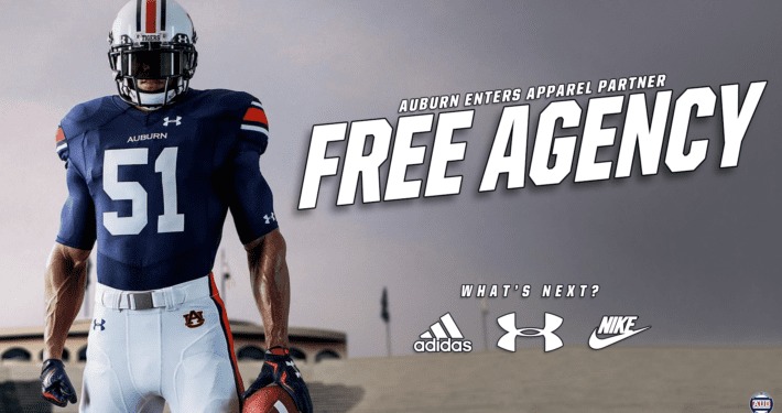
Auburn University and Nike have jointly unveiled a visually striking lineup of new uniforms for five Tigers programs, marking a bold yet respectful evolution of Auburn’s iconic look as the university shifts from Under Armour to the Swoosh. While maintaining the school’s treasured traditions, the new Nike kit introduces subtle refinements in typography, striping, fabric technology, and branding—a careful balance of heritage and innovation.
At the heart of the redesign lies an often-overlooked but significant component: the number font. Bruce-snake of fans noticed that for fall sports like soccer, volleyball, and women’s basketball, Auburn dropped the traditional Copperplate numerals for a sharp, modern alternative. The Auburn Uniform Database identified the new font as closely resembling TT Norms Standard, or perhaps a custom variant of it. This sans-serif block style feels fresh, more legible, and aligned with Nike’s minimalist aesthetic, while retaining a sturdy, athletic presence .
On the football field, however, Auburn retains its signature block numbers—those timeless, six-decade-old numerals that have defined Tigers football. Nike’s templates offer slight tweaks: slightly more condensed versions improving fit and sleeker lines, but no drastic overhaul (
The Nike Vapor F.U.S.E. template underpins the new collection, borrowing its distinctive features—a “cow catcher” collar and v-shaped chest seam. For football, Auburn remains true to its tradition, with no major changes to the familiar navy and white kits. The sleeve stripes persist in the classic Northwestern stripe motif. Nike’s update subtly refines silhouette and structure without disrupting the uniform’s identity
Pants get a similar treatment. After a hiatus under Under Armour’s beltless waistband (which cut off stripe continuity), the Nike pants reintroduce a full-length stripe down the legs. Auburn also moves the AU logo to the right hip—reconfiguring placement to harmonize with Nike’s aesthetic—notably breaking a nearly 20-year pattern .
Even helmet decals received attention. Auburn swapped their block font bumper decals for Copperplate to match the chest wordmark—though the iconic AU logo on the shell remains unchanged. The SEC decal, previously on the right, now shifts to the left stripe—another hint of meticulous detail .
Beyond uniform design, Nike’s branded equipment—cleats, gloves, and apparel—has joined the reveal. Glowing reviews from players highlight improvements in fit, breathability, and overall game-day feel. Auburn head coach Hugh Freeze called the Nike era “built for tomorrow,” while other staff recognize the recruiting edge offered by Nike’s global cachet .
Spring and fall sports also take the stage. Soccer and volleyball uniforms debut the new number font, bringing visual unity across teams. Auburn track & field was revealed to be embracing sublimated tiger stripe designs, and Equestrian unveiled new jersey-style tops with number elements—the first appearance of that sport in a uniform context . These unveilings show a coordinated rollout, though winter and spring sports will follow later.
Naturally, some alarms were raised among diehard fans. Some criticized minor mismatches: sleeve stripes not perfectly aligning with pant stripes, or the absence of alternate jerseys. One fan lamented, “the stripes on the pants don’t match the ones on the helmet or jerseys” and called the reveal “probably the ugliest jerseys in the country.” Others wished for throwback powder-blue errors or bold orange alternates Feedback from Auburn’s Reddit forums expressed similar tension—pride over protecting football’s classical look, along with a longing for subtle stylistic flourishes like a silver Final Four tab on basketball uniforms or retro powder-blue alternates
Behind the scenes, Auburn’s athletic department held tight control: they reportedly rejected Nike’s pitch for alternate uniforms, and under officials’ direction, everything adheres to the school-approved aesthetic. Nike offered the technology and reach; Auburn chose the substance and styling .
From a broader institutional perspective, the switch to Nike is strategic. Auburn is joining a roster of major college brands—Alabama, Georgia, LSU, Ohio State—all aligned with the Swoosh. The 10-year deal provides enhanced visibility, recruiting cachet, and upgraded training apparel. Men’s basketball associate head coach Steven Pearl and softball co-head coach Kate Malveaux highlighted Nike’s commitment to athletes’ performance and profile. Auburn’s athletic director John Cohen said he welcomed a global brand that elevates Auburn’s positioning
Practical rollout begins July 25, when the new merchandise hits campus stores and online outlets. Fans will soon see replica jerseys, apparel, and gear modeled after the ones their team will wear on Aug. 29, when Auburn kicks off the season under the Baylor lights
Fan energy is already reminiscent of past eras. In the locker room, players are excited by the new fit and function. One linebacker remarked, “These aren’t just uniforms, they’re battle gear.” Coaches, gear managers, and equipment staff are enthusiastic about Nike’s fabrication and attention to detail .
The Auburn Uniform Database continues to chronicle each reveal and iterate update—as details emerge through preseason photos, games, and fan feedback. As seasons progress, additional sports will show off new Nike gear. Word is fans might see alternate designs or powder-blue tributes first glimpsed in mockups or early speculations—but those are likely years away, dependent on approvals, manufacturing, and tradition
In sum, Auburn’s move to Nike is not a rebrand—it’s a retooling. At the core, nothing dramatic has changed: the navy and white color scheme, Northwestern stripe heritage, and block number fonts remain intact. What has shifted is the framework: slimmer fonts for non-football sports, sleeker pant integration, enhanced helmet lettering, performance-enhancing fabric, and the aura of a globally recognized brand.
For fans who cherish tradition, this balancing act will resonate. For recruits and athletes focused on gear and performance, the new uniforms signal that Auburn is keeping pace with elite programs. For the institution, this represents a reinvestment in athletic infrastructure, brand presence, and revenue potential.
There’s a promising horizon ahead. As fall arrives and teams suit up, fans will see how these design changes hold up under game pressure—in puddles, under lights, or faced with full-speed hits. Will the stripes stay intact? Will the new typography read crisply at 50 yards? Will the tiger stripes on track uniforms sway subtly in wind?
Unlikely though it seems, even small alternations—or a single powder-blue alternate game—might find their way onto the field. But for now, Auburn stands firmly on its foundation: navy, white, Copperplate wordmarks, Northwestern stripes, and a template updated for 2025. Nike isn’t drafting a new narrative—they’re providing fresher ink.
The Swoosh era begins with continuity and care. Tradition lives on. Innovation keeps pace. And the Tigers, once again, look ready to roar—with uniforms that respect their past and ready to tackle the future.
War Eagle.


